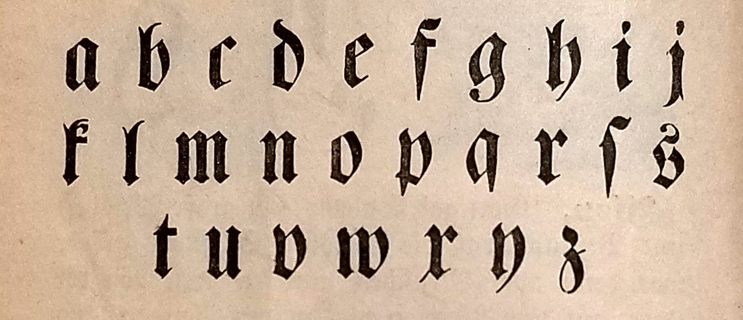
Fraktur is a typestyle created in the early 1500s, based on earlier scribal “hands.” From the late sixteenth to the mid-twentieth centuries, it was the most common kind of type used in printing the German language.1
Fraktur is a way of representing the Latin alphabet; it is not a separate alphabet, any more than italics are. But from a language learner’s perspective, it is still useful to think of Fraktur as a foreign script like Greek or Cyrillic.
It was once taught like one. During the time of Fraktur’s dominance, textbooks for English-speakers usually included a table of what they called the “German Alphabet,” and sometimes printed the first few lessons in a more familiar (Roman)2 typeface so that students could get some acquaintance with the language itself before having to read it in unfamiliar letterforms.
Today, Roman type is universal in German-language publications. The only places you’re likely to encounter Fraktur, even in Germanophone countries, are newspaper nameplates, beer labels, and the occasional street or shop sign.
Still—out of completism or curiosity, or because you have an academic or hobbyist need to deal with old German texts,3 or because you’d like to be able to read the large selection of free facsimile books (some long out of print and never available in Roman type) on sites like the Internet Archive, HathiTrust, and Google Books—you may wish to become conversant with Fraktur.
If so, what follows will be a useful starting point.
Here, I’ll go through (most of) the letters themselves, with an eye to disambiguation. I’ll treat the letters in batches, grouped by their potential to be confused with one another, first giving a large image of the letters in a modern Fraktur font,4 then supplementing them with images from several authentic printed works.5 These authentic examples show some of the variations that can crop up.6
At the end, I’ll provide a few additional short passages, also from authentic printed works. You can use these to practice and test your Fraktur-reading skills.
German has gone through several spelling reforms. When obsolete spellings (or unfamiliar abbreviations) occur in the examples, I’ll point them out.7 (I’ve avoided archaic spellings in the practice examples.)
I am, if it was not obvious already, neither a calligrapher nor a palæographer nor a typography nerd—nor, for that matter, a native German speaker. If anything I say crosses the line from imprecision into outright error, corrections are appreciated.
These are Aa and Uu. The lowercase forms are fairly intuitive, but uppercase A is easily mistaken for U because of its open top.
This large decorative capital A (from the Volksbuch) is more nearly Roman in appearance.
The As in the running text have a pinched-together top.
In the encylical, we see the A in two different typefaces. In the second, it is de-Uified somewhat by an exaggerated (almost circular) swash. The U in this document is particularly straight and square.
These are Bb, Pp, and Vv. The Cupid’s-bow shape of uppercase V can easily be confused with B. Lowercase v is similar in shape to b, and its closed top means it can also be confused with o (though context usually takes care of this).
Here in the encyclical, the uppercase Ps in Papſt Pius also have a B-like shape, and both the upper- and lowercase forms have extremely short descenders. Compare P with the B in Brüder.
This is more challenging to read because of the faintness and brokenness of the reproduction. Compare B in the first word (Boden) with P in the last (Pappeln).
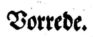
This is the word Vorrede (“prologue” or “preface”) as it appears in the Volksbuch.
Vv in the encylical: Vertreter, vermindert.
These are Ee, Gg, and Ss. Uppercase E and G look similar at first glance, but G is closed at the front, and E is open.
Uppercase C (not pictured here) can sometimes also be confused with E or G—you’ll see an example below.
Uppercase S has a certain resemblance to Roman G—but it’s possible, and helpful, to see it instead as a Roman S that has gotten out of hand and looped back over the top of itself.8
In the example above, I’m showing the “round” lowercase s, which properly appears only at the ends of syllables or words. (We’ll get to the long ſ in a moment.)
Here are the phrases mit dem Geiſt and und ſeiner Seelen from the Volksbuch. G and S strike me as almost impossible to distinguish here. Context is king.
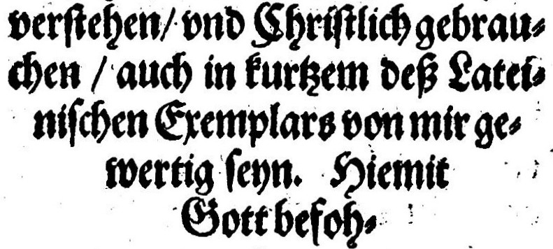
Compare the C in Chriſtlich (first line) with the E in Exemplars (third line) and the G in Gott (last line).
In the encyclical, you can see the S in Speyer set two different ways (the lowercase y also differs, but we’ll get to that later). The first is the G-like form, and the second looks like Roman S.
These are Ff and Sſ. The lowercase eff/eſs resemblance is one of the most famous sources of typographic confusion, even in English, and you can see why: they differ by only a jot.
Here, Gottesdienſt shows both round s and long ſ. (In Roman type, it would normally be printed as Gottesdienst.) The last word, Karfreitags (“Good Friday”), shows Fraktur f.
This scene heading from the play uses an out-of-the-ordinary typeface—not Fraktur in the strictest sense. It reads Freies Feld.
These are Ii and Jj. In light of their history together, it makes sense that these letters are so similar to one another.
In some Fraktur typefaces the uppercase forms are not even distinguished from one another. In this example from the play, the I in Immer and Ihr is identical to the J in Jetzt. (If you’re having trouble finding it, Jetzt is the second-to-last word.)
In very old texts, lowercase i may also take a j-like form, but only at the beginning of a word. So here it does so in the middle word, ihm, but not in the words surrounding it.
Thes are Kk, Rr, and Xx.
Lowercase k is one of the greatest stumbling blocks in Fraktur, not because it resembles another letter, but simply because its “uptight” shape is so unlike Roman k.
In newer fonts, including many implementations of 𝔘𝔫𝔦𝔠𝔬𝔡𝔢 𝔉𝔯𝔞𝔨𝔱𝔲𝔯, k has a fuller appearance that is similar to Roman (or, more particularly, cursive) k.
Rr is a double-whammy: the uppercase form can be confused with K, and the lowercase form can be confused with x. That latter issue might not be evident from the example, because this font puts a crossbar through both X and x. But—as we’ll see in a moment—not all Fraktur fonts do this.
Here in the word [Zau]berwerck9 and the name Wozzeck, ck appears as a ligature. Ligatures are another part of the complexity of Fraktur; I’ll delve into them more toward the end of this piece.
Here we see uppercase K in Kirche (first line), and lowercase k in Bekenner, Bekennerinnen, and Volkes (second and third lines).
Here’s a different uppercase K in Katholiſchen Kirche. Compare with the R in Reich.
Another scene heading from the play. The word is Kaſerne (“Barracks”). Also note the austerity of the long ſ.
— hörſt du nix, Andres ? This x looks a lot like r: because there is no crossbar, the only distinction is a tiny additional stroke10 on the bottom left. Once again, context helps: nix is a perfectly good colloquial word, but nir would be nonsense here.
Exemplars. Compare this x (with a slightly more distinct tail) to the r.
When used as a Roman numeral, X is set in Roman type.
These are Ll and Tt. Uppercase T is easily mistaken for L, not because there is any real resemblance (apart from a similar bottom stroke), but because it looks so unlike Roman T that it’s easier for the mind to leap to another interpretation.
Leibhafftiger Teuffel. Here we see a simpler L and a particularly broad and bottom-heavy T.
Additional examples: einem Tiſch in einem Laden and der erſte Teil.
These are Mm and Ww. In Roman type, these letters are more or less upside-down of each other. In Fraktur, they are differentiated by Ww being closed (at least partly) at both top and bottom, while Mm is closed only at the top.
W, of course, originated as a doubled V. Compare the shapes of W in Wille with V in Vaters (first image), and of v and m in vollſtändigem with w in wird (second image). In this instance, lowercase w is fully closed at the bottom.
In this example from the Volksbuch, the w in Antwort is closed at the bottom on the right side only.
These are Nn and Yy. To a person accustomed to reading Roman type, they can look similar.11
These say von Speyer and Speyer, den, respectively.
An example, from the Volksbuch, of y and n next to each other. Note that the descender of y does stretch down as far as that of ſ. (The same is true of y and p in the previous image.) The resemblance to n is more at the top of the letter than at the bottom.
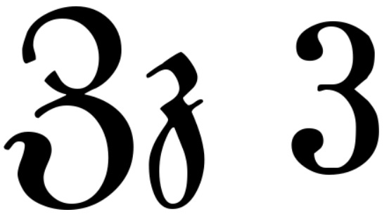
These are Zz and the numeral 3. If you write cursive, the lowercase form might resemble your handwritten z. The uppercase form is also notably similar its Cyrillic counterpart, З.
Upper- and lowercase Zz in the Volksbuch.
In some blackletter typefaces, lowercase z also has a 3-like shape. Here we see two versions of this in the name Wozzeck. (This alternate z is also reflected in the Fraktur form of ß and in some ligatures.)
These are ß and ſz. Because it is now treated as a letter in its own right (and therefore is also used in Roman typefaces), ß is the only Fraktur ligature that computer fonts typically support. I’ve included ſ and z—its original components—for comparison.
These four words from the encyclical show z, long ſ, ß, and round s, respectively.
Ligatures are specially designed combinations of two letters. They are common in Fraktur printing—you have already seen several in previous examples. Some are nearly unnoticeable, but others differ in form from their base letters and must be learned.
The ligature tz in the Volksbuch and the encyclical.
The ligature ch in the encyclical. Capitalized Ch is not a ligature.
Examples from the play of ch (Stich and ſtich in the top image and ſchlafen in the bottom) and ck (Zickwölfin in the top image, Wozzeck in the bottom). Wozzeck shows ck with an alternate, fuller form of k.
These are äöü, the umlauts.
The sounds of the umlauts can also be spelled ae, oe, and ue,12 and their form actually derives from this spelling: originally, as seen here, the marks on top were a tiny e.
During most of the time that Fraktur was prevalent, the umlauts were spelled out when capitalized: Ae, Oe, Ue. For this reason, “dotted” uppercase forms are rare.13
Examples for Practice
Answers and links to the sources are in the footnotes. Here (unlike in the previous section), I will transcribe long ſ as s.
This bilingual vocabulary list is from an English-language school reader printed in the 1890s.14
This is from the title page of a book printed in the 1840s.15
This is from (a facsimile of) a greeting card printed in the 1760s.16
These lines are from a poetry anthology printed in the 1910s.17
This, with its elaborate and challenging capitals, is from the title page of a play printed in the 1760s.18
For more on the history, you could start with this blog post (650 words) or this podcast episode (42 minutes). For an ab ovo look at the calligraphic context from which blackletter emerged, try this article (5000 words) written by a working calligrapher.
Throughout this post, I’ll use “Roman” to refer to the ordinary letters used for printing most European languages (including English and today’s German), and “Fraktur” to refer to any blackletter typeface used for printing German.
Technically, that’s a loose usage: Fraktur is only one of the several blackletter typestyles. But Germans themselves tend to use the word loosely. The other style often seen in German-language texts, Schwabacher, is particularly similar (and a direct predecessor) to Fraktur.
Though for genealogical research you’ll probably need to learn old German handwriting, which is challenging in its own right (and not covered here).
Typographer Fraktur Medium, which is also what I used to make the So klug logo.
The sources are from the sixteenth, nineteenth, and twentieth centuries. The older source is included to demonstrate the stability and continuity of this typestyle. The newer ones are included because they represent the time period of most of the Fraktur books you’re likely to run across in everyday life.
The sixteenth-century source is this page along with this one from Historia von D. Johann Fausten, commonly called the Faust Volksbuch (printed 1588). I will refer to it as “the Volksbuch.”
The nineteenth-century source is this page from Georg Büchner’s collected works (printed c. 1879). It is from his play Wozzeck (a.k.a. Woyzeck). I will refer to it as “the play.”
The twentieth-century source is this page from the 1937 Diocese of Speyer printing of the papal encyclical Mit brennender Sorge (including parts of both the letter itself and the local bishop’s introduction to it). I will refer to it as “the encyclical.”
For a broader overview of letterform variants, have a look at the tables on this page. They show the variants available in UnifrakturMaguntia, an ambitious project that seems intended to capture the whole scope of Fraktur in one font.
I don’t count the long s as an obsolete spelling. Even since the most recent spelling reform, it’s still correct to use it in Fraktur.
For those with a Classical bent—not me!—Greek σ may be a useful mnemonic as well.
The word is incomplete here because it’s split across two pages.
Which may originally have been larger, but is hard to see in this reproduction.
Because Fraktur is mostly found in old books, reading it well requires not only deciphering the letterforms themselves, but also accommodating imperfections caused by rough printing technology, aged materials, and—for electronic versions—trade-offs in the digitization process.
Y is a fairly uncommon letter in German (which is why they use QWERTZ rather than QWERTY for their keyboards—Z is much more common).
You see this today mostly in plain-computer-text situations where umlauts are not supported (or support cannot be taken for granted). For example, the URL for the University of Tübingen is uni-tuebingen.de.
There was a period in the nineteenth century when the two practices overlapped. Nietzsche (or his publishers) used the spelling Übermensch, but contemporaries responding to him tended to prefer Uebermensch.
entdecken
Radiergummi
Binde; Verband
schnell herumdrehen
Source: The Fourth Reader. St. Louis: Concordia, 1894.
Ein Volksbuch für Jung und Alt
Source: Orbis Pictus. Stuttgart: Balz’sche, 1841.
Auf das Heil. Weinachts Fest 1769.
Source: Christmas greeting. Ephrata: Ephrata Cloister, 1769.
Es gingen drei Jäger wohl auf die Birsch,
Sie wollten erjagen den weißen Hirsch.
Sie legten sich unter den Tannenbaum:
Da hatten die drei einen seltsamen Traum.
Source: Easy German Poetry for Beginners. Boston: Ginn, 1912.
Xerxes,
der Friedsame.
Ein
Heroisches Schauspiel, in fünf Aufzügen.
Source: Xerxes, der Friedsame. Vienna: Kraußichen Buchladen, 1764.








Wonderfully detailed! Love the notes too.
Love this! Fascinating!